Final
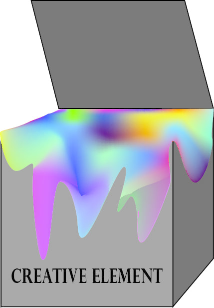
For our final one of the things that we had to was make a logo for a company called Creative Element. I just drew a box and used the mesh tool to make the paint in the box all colorful, and moved it to make it look like it was falling over the sides.
AD Project
In this project we had to make an two adds for a company that we chose. We had to make a paper flyer first, and then we could choose what we wanted to do for our second one. In the flyer and the billboard ones that I made I used the company Coffee Bean. On the flyer we had to do the outside and the inside, we had to have pictures, contacts, a heading, and it had to be eye catching. On the billboard one that I made it had to be big, to the point, it could point where to go to find the place, and it had to have pictures.
Logo Project
With this project we had to learn how to make a good logo, and we also had to learn color value. We had to make three logos that were appropriate, simple, versatile, timeless, and memorable. We also had to use colors and fonts that would fit with our logos. It was a little difficult doing this project because when we tried color a certain space in sometimes it wouldn't work so we would have to go grab part of a sublayer to put underneath it so that it would color. It was also a little difficult to come up with names, but other than that it was easy.
Typography
With this project we had to choose three words and then we had to make those words look like what they meant. With the Measured one I used Photoshop, and the other two pictures I used Adobe. Measured I made by making a clipping mask with a ruler, and then added the desk background in. Translated I made translated 3d and then added a shadow that said Traducido which is translated in Spanish. With the fist I made by messing around with the effects until I got is to where it sort of looked like a fish, and then I just sort of stuck with it.
Cropping Mask Project
With this project we just had to choose the background of the word we wanted, then we would use a clipping mask to where the words were on the top, then we just had to choose the background that we wanted behind the word.
Surrealist Photo
With this project we had to make a surrealist photo. It had to be something fake but looked real. With this the only problems that I faced was getting the fish and turtle to blend in with the others, and to try and make the fire look somewhat decent on the animals. With the fish and turtle I just had to change the brightness and the colors, and with the fire I had to change the opacity to where you could sort of see through it so it looked more realistic.
Realistic Photoshop
For this project we had to use Photoshop, and take one picture and take out one item. Then after that we had to go and add two more items in that weren't there. While doing this the only problems that I had were when I had to take the flower out, and when I had to put the duck in. The duck sort of stuck out so I had to make it to where he didn't stick out as much by changing the shading and the lighting. With the flower I had to use the clone stamp tool to fill in the background were it was.
Realistic Drawing
Doing the realistic drawing was super fun, we learned how to use the mesh tool, how to create shadows, and how to make 3d looking things. It was fun but there was a lot of changes that had to be made to get the right shading.
Own Character design
This assignment was a lot easier than the first because by now I knew how to work with the tools more, and it was a lot more fun to do this one. Because I was able to make my own character, and add some shading which was fun to play around with.
Mickey Mouse Practice
We had to trace over Mickey, and then we had to fill him in with color. It was actually super fun to draw him, and it wasn't really that difficult. It was at first because I didn't know how to use the program, but then after I got it, it was super easy.
